Extend the functionality of your forms with Everest Forms pro.
Advanced Fields #
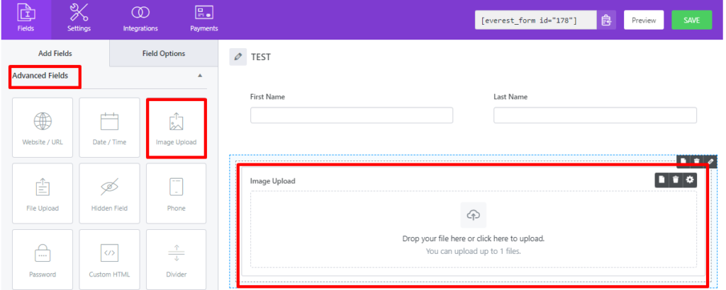
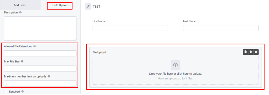
Image Upload #
Insert the Image Upload field to let your form fillers to upload any image (jpg, png, gif, etc.) type in the form.
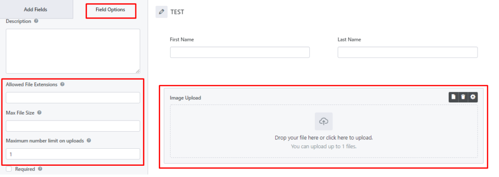
Additional Settings:
- Allowed File Extensions: You can restrict to only allow certain types of images, such as gif, png, BMP, etc. Enter the multiple extensions separated by comma (,).
- Max File Size: Enter the max file size, in megabytes, to allow. If left blank, the value defaults to the maximum size the server allows.
- Maximum number limit on uploads: Allows you to enter the number of image uploads for this field.
- Store image in WordPress Media Library: Check this option to store the final uploaded file in the WordPress Media Library.
File Upload #
Similar to image upload, you can use the File Upload field to allow the form fillers to upload any type of file on the form.
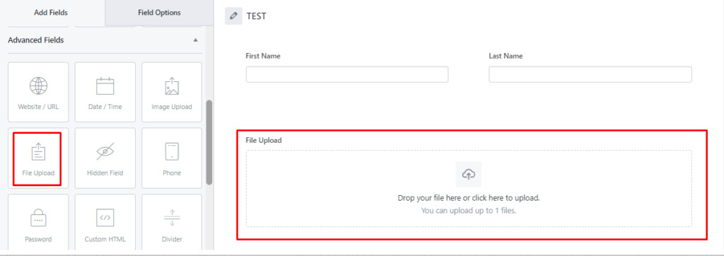
You can change the label and the description, and change the additional settings. Just like the Image Upload field, there are additional settings: Allowed File Extensions, Max File Size, and Maximum number limit on uploads.
Note: With Everest Forms Pro v1.3.7 and above, you can also save the uploaded files directly to Google Drive and Dropbox. Learn more about it here.
To upload files with extensions that are not supported by the WordPress, please visit the Link for more details.
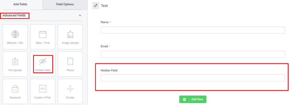
Hidden Field #
Similarly, you can drag and drop the hidden field. The Hidden Input field is not displayed on the page, so it does not allow visitors to add anything to it. The Hidden Input allows you, the webmaster, to add specific information to a form, to be passed through the form processor along with the data entered by the visitor.
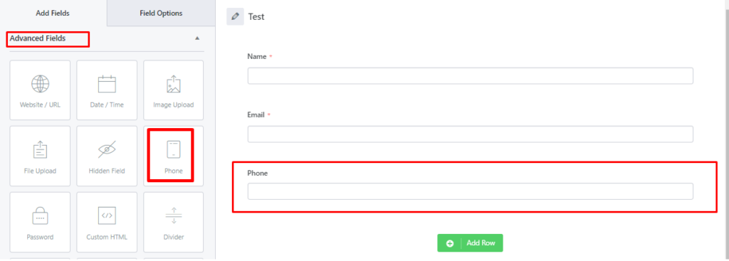
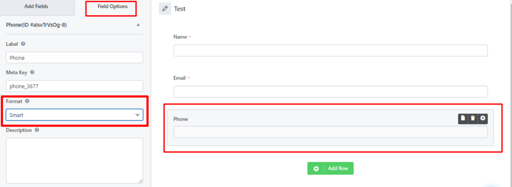
Phone #
Phone number field allows to only add phone number in the frontend.
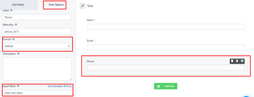
For more settings, go to the Field Options by clicking on the Phone Field. Here, you can change the Label, Meta Key, Description like any other field. But, there are two main field options for Phone: Format and Input Mask
When you select the Format as Default, you can see the Input Mask option too where you can enter a custom input mask.
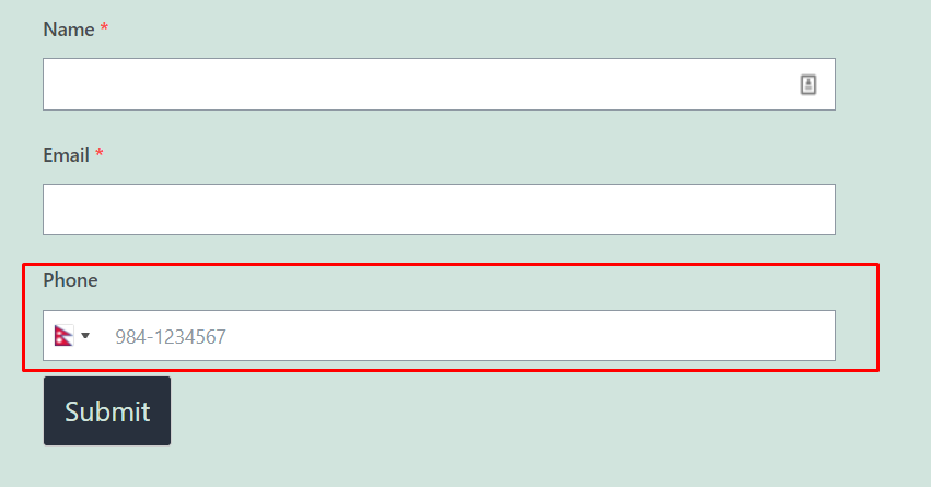
When you select the Format as Smart, it displays the country flag with validation and you don’t need to enter an Input Mask.
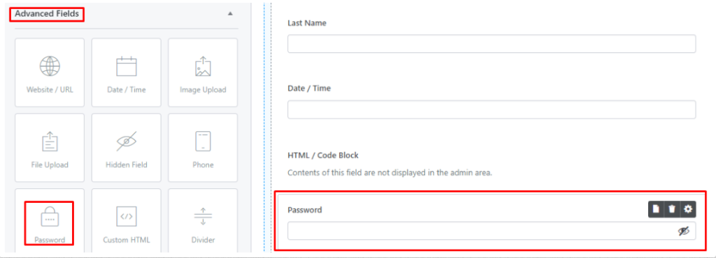
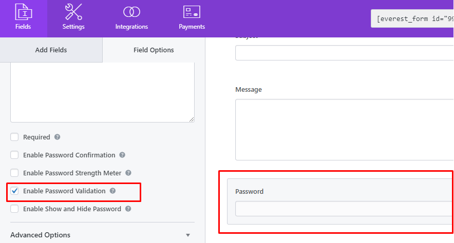
Password #
A password field on your form doesn’t display what the user types. Each keystroke is represented on the screen by a placeholder character, such as an asterisk or a bullet so that someone looking over the user’s shoulder can’t see what they type.
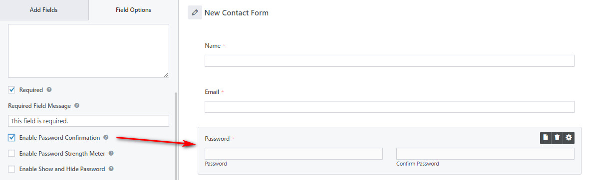
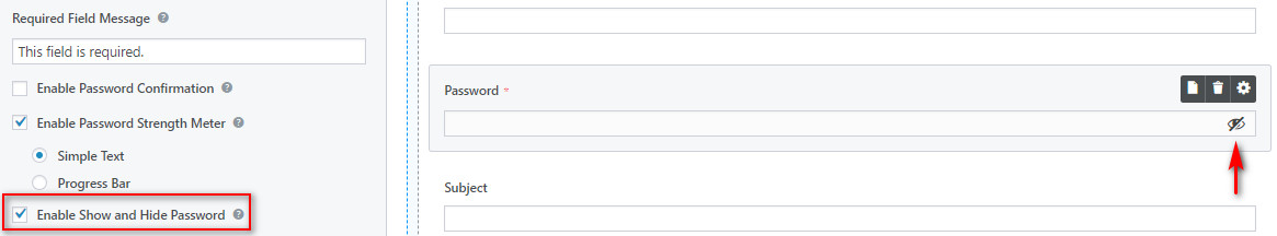
To change the Password settings, go to the Field Options. Here, you’ll see various options such as label, description, and required. Other than that there are three options for the Password field.
Enable Password Confirmation: Enabling this option will add a Confirm Password field to your Password Field.
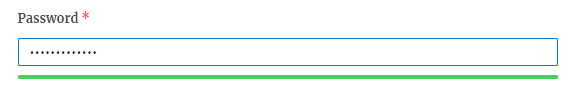
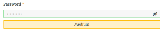
Enable Password Strength Meter: Enabling this option will show a password strength meter on the frontend of the form to the user input. There are two choices: Simple Text and Progress Bar.
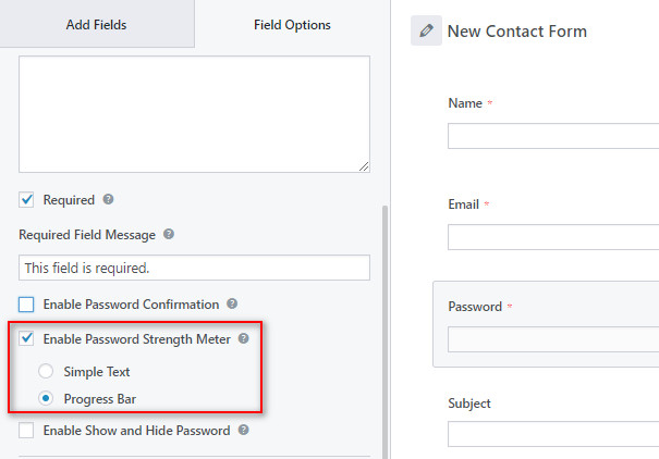
Simple Text
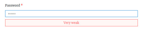
Progress Bar
Enable Show and Hide Password: Enabling this option will add the show and hide feature to your password field so that users can view or hide the entered password on the frontend.
Enable Password Validation: Everest Form introduces this feature to check a password validation which contained minimum characters of at least one lowercase letter, one uppercase letter, one numeric digit, and one special character.
Divider #
The divider field is introduced to show heavy forms in a structured way by creating the different sections using the divider fields. It helps to create a clean and structured form that looks attractive to the users.
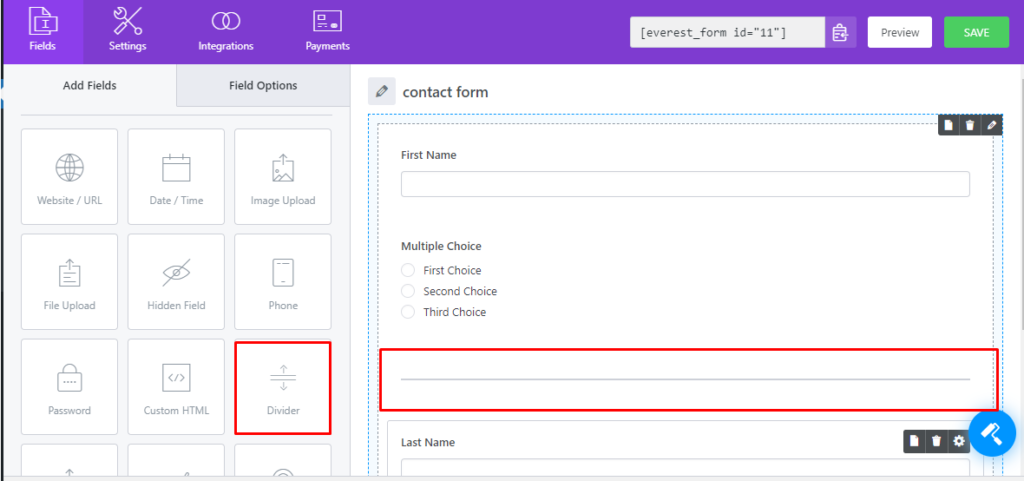
You can select the type of divider like plain, dotted, dashed, thick or double which you want to display on the front.
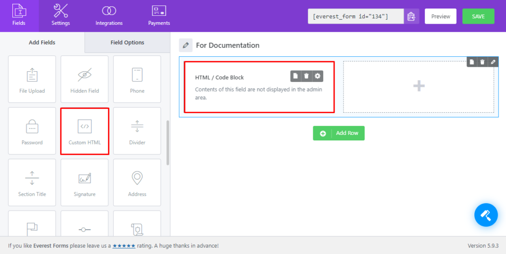
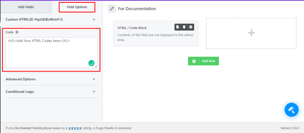
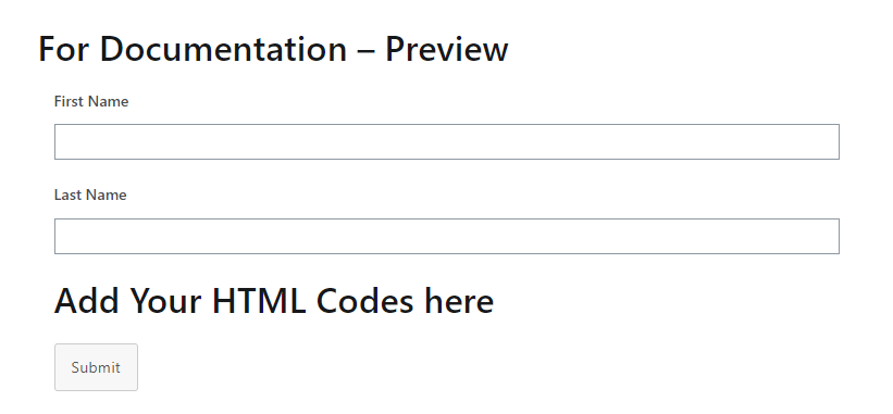
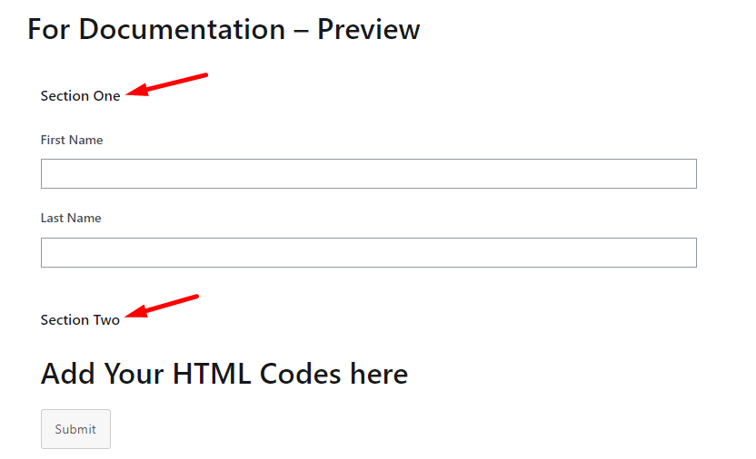
Custom HTML #
With Custom HTML, you can display the code entered in the backend (custom field settings ).
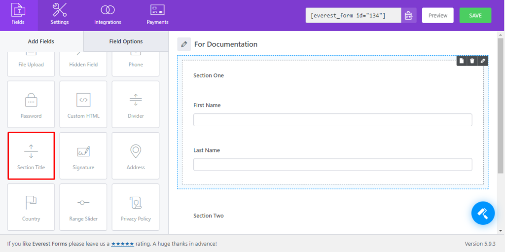
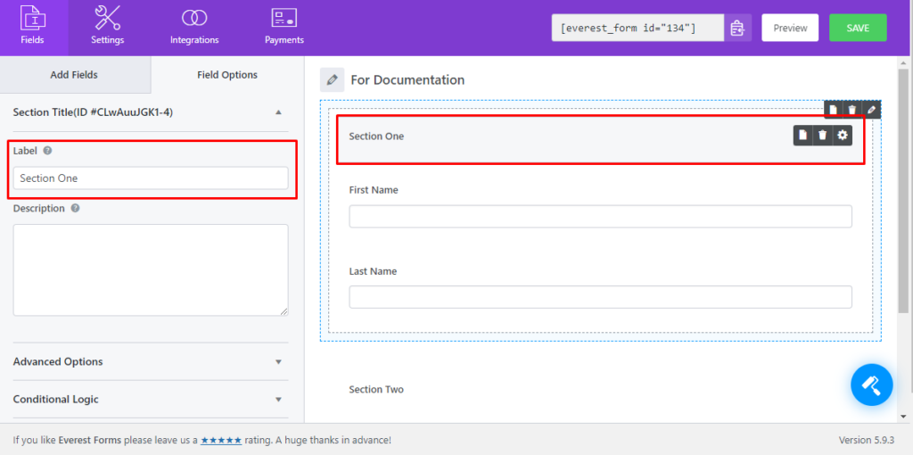
Section Title #
The forms can be divided into sections and using the section title field, you can add titles to each of these sections.
Address #
Address Field allows users to enter all address related information. Address field includes:
- Address Line 1
- Address Line 2
- City
- State/Province/Region
- Zip/Postal Code
- Country

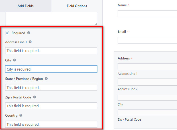
On the Field Option, you have the regular settings for label, description and required. Also, when you check the required option, you can edit the required message for each subfield of the Address field.
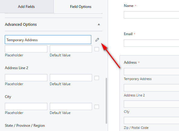
In the Advanced Options, you can see the edit option for each subfield. To change the sub-labels, click on the edition option or simply click on the subfield name.
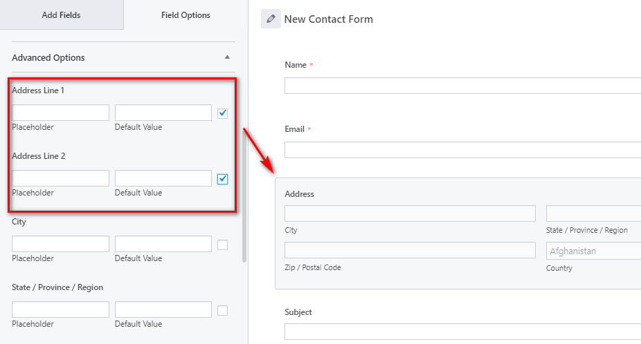
You also have the option to show only certain address fields from settings. By default all address fields are displayed, if you want to remove certain fields, check the checkbox indicated in the above figure.
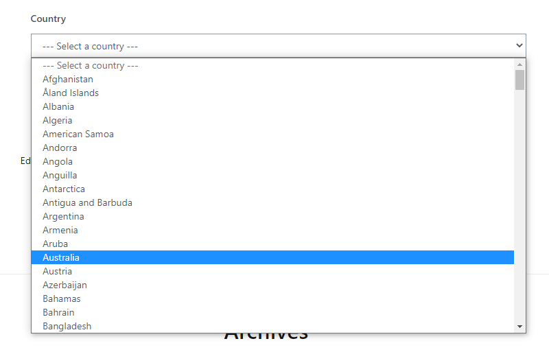
Country #
With the country fields, you can list all countries in a select box for the user to choose from.
In the Field Options, you can see the settings for the Country field such as label, description, required, and more. The main settings are:
Enable Country Flags: This option allows you to show the country flags on the frontend of the form.
Default Country: This option allows you to choose the default country so, the users cannot choose the country.

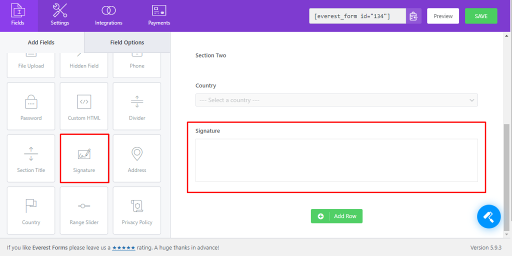
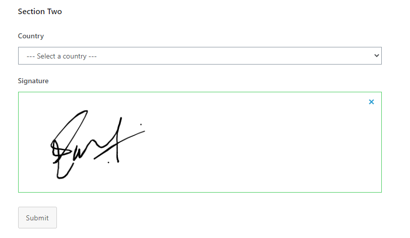
Signature #
The Signature field allows users to add E Signatures on the WordPress forms with no trouble. Form fillers can use the Touch Screens or even Mouse to sign on the form.
Range Slider #
The Range Slider Field allows you to display a beautiful user-friendly bar slider at the front end of the form where users can select a value from the provided data by dragging the Handle.
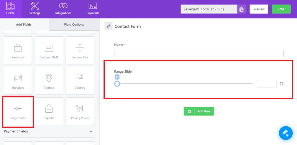
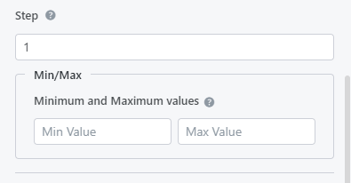
On clicking on this field, you will see General Option to set the Minimum Value and Maximum value of the Slider. You will also be able to set the Step that the Sliding Handle will take when sliding in in action.
Click on the Advanced Options and then you will see the Advanced Settings for the Range Slider.
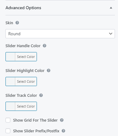
In the Advanced Options, you are provided a lot of options to customize with. I will briefly let you know the purpose of each of them.
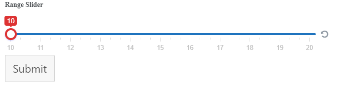
Skin: This option can be used to select the Sliding Handle Type. You have these options to choose from. Flat, Big, Modern. Round, Sharp Square.
Slider Handle Color: This option lets you select the color for the slider handle.
Slider Highlight Color: This option lets you select the color for the dragged slider track. This color will be shown in the track from the starting point to the current position of the slider handle.
Slider Track Color: This option lets you select the color of the entire track from Starting to Ending on which the handle will slide.
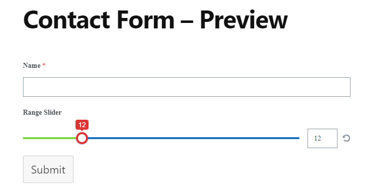
For example, the Slider will look like this if I selected Red Handle color, Green Highlight color, and Blue Track color for the slider.
Now, Let’s discuss other options:
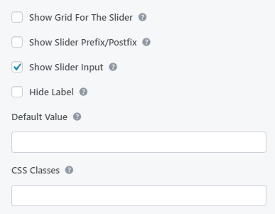
Show Grid For The Slider: If you enable this option, you will be shown a grid of your Minimum and Maximum Value in the front end.
Show Slider Prefix Postfix: After you enable this option. you will be able to show the Prefix and Postfix on top of Starting and Ending points of the Slider. In the screenshot below, I have used Go and Stop as Prefix and Postfix for the Slider.
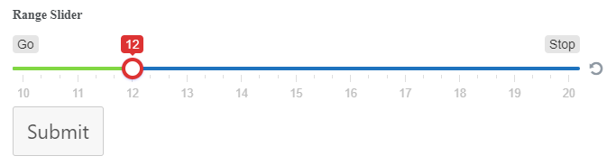
Show Slider Input: Enabling or Disabling this option will let you show/hide the input box at the end of the slider.
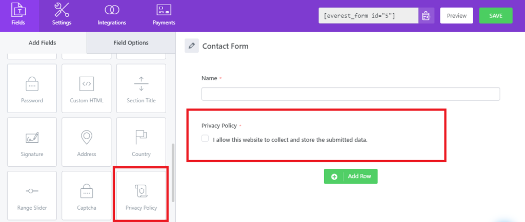
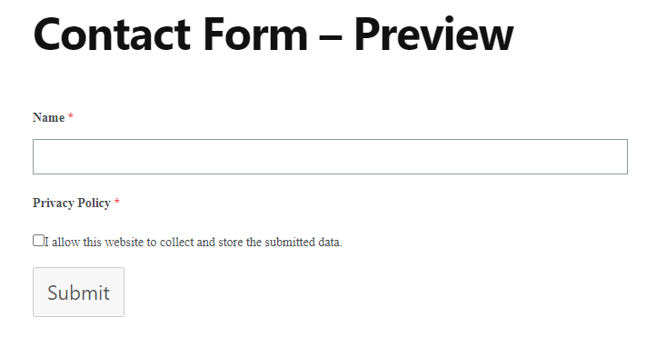
Privacy Policy #
This field allows you to place a “terms of use” or “site policy” on the contact form. You can type the Consent Message, link pages of your site, and external URL in the Consent Message.
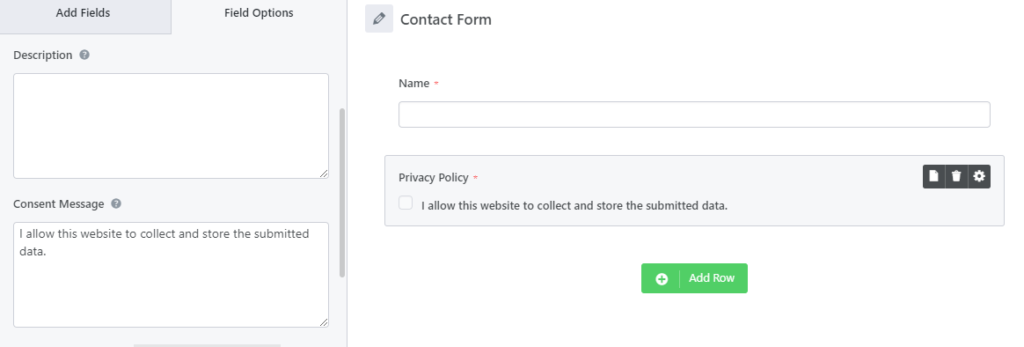
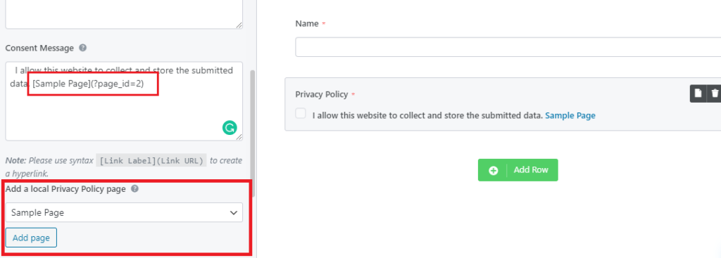
After you click on this field, you will see the available options for playing around with this field in the field options. You will see three major sections, the Consent Message, Add a local Privacy Policy Page, and Add a custom URL option. We will discuss these one by one.
Consent Message: The Consent Message is the input section where you can enter the message that the form visitors can read directly. This where you can write “I accept the Terms and Conditions“, “I agree to the site’s User Policy” or anything that suits your need.
After you enter the Consent Message and save the form, preview it, you will see the Consent Message on the front-end as it is.
Add a Local Privacy Policy Page: This option lets you to add a link to one or more pages of your website in the Consent Message. You can simply select a page from the dropdown and then click on Add Page. It will add a syntax in your consent message which creates a hyperlink. You will be able to see the changes instantly in the form builder about how it will look in the frontend. For example: see screenshot.
Note: The best part about adding a local page is, the user will be able to see the link in the frontend and when they will click on the link, the contents of the link will be shown them as a dropdown instantly. Thus, form visitors will not be redirected to a different page during the form submission process if the link is a local link. See the example below.
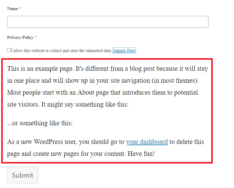
In the screenshot above, you can see, the contents of the Sample Page is shown when I click on the link. Similarly it goes away when you click on the link again. Thus is will be a beneficial addition to your form.
Add a Custom URL: This option lets you add a custom URL in the consent message which could be an external link to a page containing the Privacy Policy. You will need to type the label name for the URL and then enter the URL in the respective input boxes.
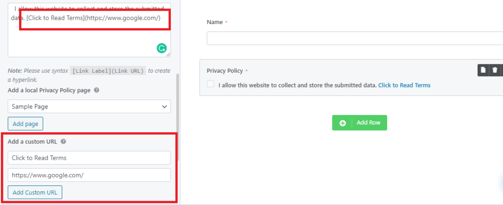
Note: In this case, if the user clicks on the link, the link will open in a new tab so that the user can read the terms there and then agree or disagree with the form submission.
WYSIWYG #
What You See Is What You Get, in short WYSIWYG is a system in which editing software allows content to be edited in a form that resembles its appearance when displayed as a form entry or a PDF document, etc.
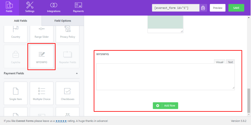
On clicking on this field, you will see Field Options, where you can set different attributes for the WYSIWYG form field.
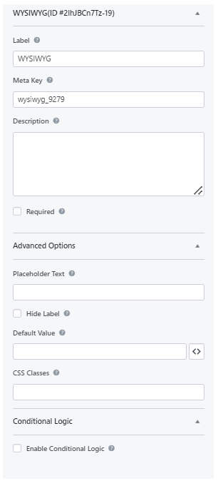
Here, 'Default Value' can be set by clicking on the <> icon. The value includes, site admin email, name, URL, page title, etc.
Payment Fields #
Payments Fields are helpful if you have the Payments add-on such as PayPal Standard activated. The fields will be described in the add-on section.

The payment field includes five form fields. Each of them is listed below:
- Single Item: Allows you to add the Name, Description, and Price for a single item on your form.
- Multiple Choice: This allows you to add multiple items and their relative prices on your form so the users can choose one item from it. Also, there is the image choice option which lets you add an image for each item for a better representation of your items.
- Checkboxes: This allows you to add multiple items and their relative prices so users can choose one or more items from it. And, you can add the images for each item like the Multiple Choice on your form.
- Quantity: This allows users to enter the quantity of the items selected. This allows the Total field to calculate the overall amount for the items selected X the quantity entered by the user.
- Total: This shows the total price of all the items selected by the users.
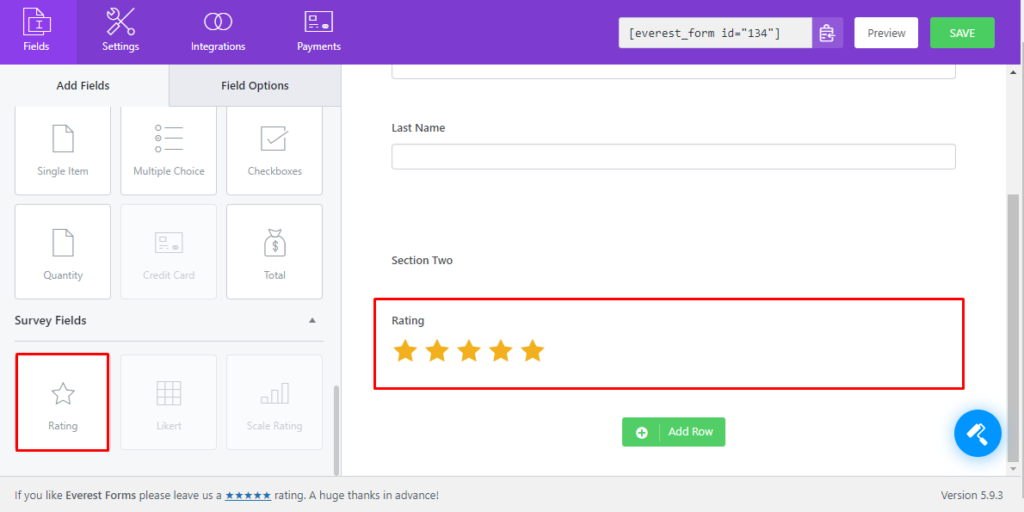
Survey Fields #
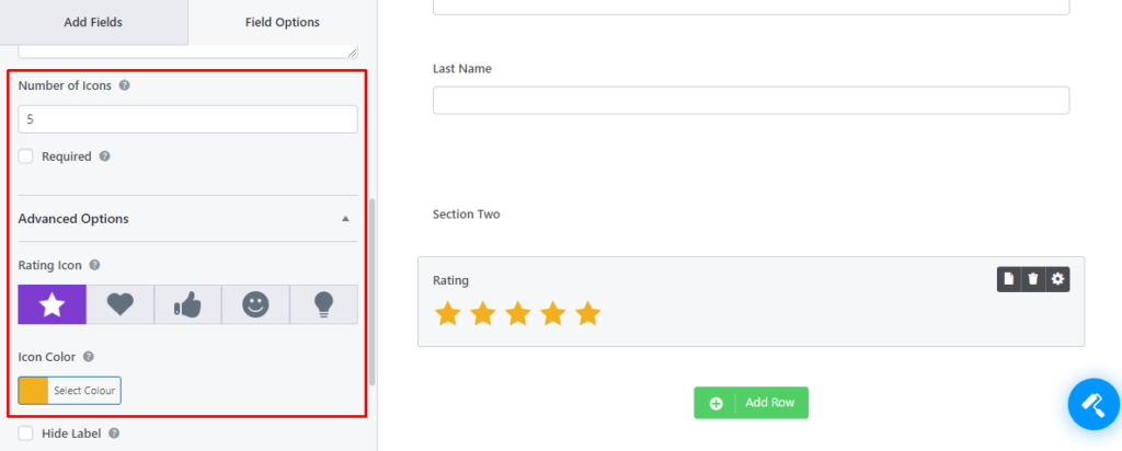
Rating #
In the Everest Forms pro version, you can use the Rating field which comes under the Survey Fields. It is a very useful field for taking reviews from the users in a form.
In the Field Options, you can change the Label, Meta Key, and Description like other form fields. There are more options specially meant for rating.
- Number of Icons: You can enter the number for the icons to be displayed in the rating.
- Rating Icon: This option allows you can choose a rating icon other than Star. There are five options to choose from.
- Icon Color: Also, you can change the color of the rating icon according to your liking.