
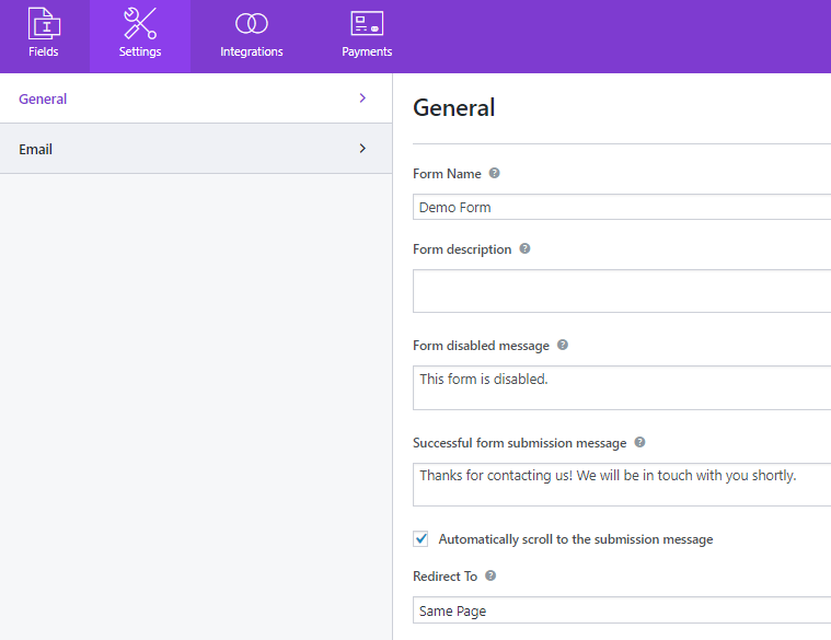
- General
- Form Name:
- Form Description:
- Form disable message:
- Successful Form Submission Message:
- Submission Redirect:
- Layout Design:
- Form Class:
- Required Indicators:
- Submit Button Text:
- Submit Button Processing Text:
- Submit Button Class:
- Enable Conditional Logic:
- Disable Storing Entry Information:
- Enable form field icons(Premium)
The General Settings consist of the basic form settings such as Form Name, Submission Message, Redirect To, Layout Design, Submit Button settings, Honeypot, and reCaptcha.
We have explained each setting for you to understand the functionalities.
General #
Form Name: #
Gives your Form a name for eg: Contact Form
Form Description: #
This text is displayed to describe the purpose of your form. After you enable the Form Description option from the Gutenberg, this text is displayed.
Form disable message: #
This text is displayed when you disable the form using the toggle button from Everest Forms -> All Forms tab. You can check out our docs for how to disable a form for a detailed guide.
Successful Form Submission Message: #
Text displayed to your users after you have successfully received their forms.
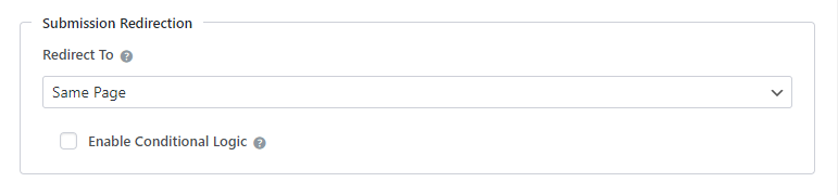
Submission Redirect: #
Lands the user to the desired URL after the form submission. Once the form is submitted you can choose to redirect to any custom link, WordPress Page, or remain on the same page. The drop-down has three options
- Same Page: By default Same Page is selected. This means once the form is submitted, the user will remain on the same page.
- Custom Page: If Custom Page is selected in the dropdown, a new option Custom Page will show up just below Redirect To option. This new option will have all your pages listed. You can select any one page from the drop-down where you wish to redirect. Here, you can also pass the field data via Query String.
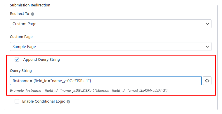
Wanna know more about auto-populating form fields with append query string?
Also, check this out to auto-populate one form's data to another.
Note: The WordPress reserved strings can't be used for appending via Query Strings. For more details, visit https://developer.wordpress.org/reference/functions/register_taxonomy/
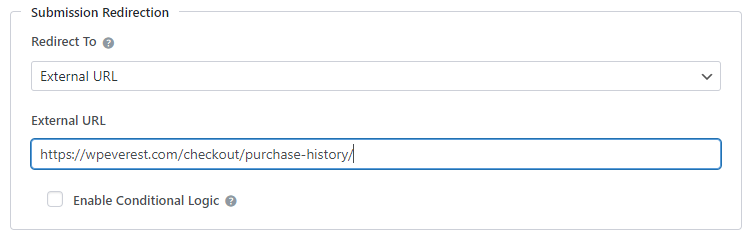
- External URL: If External URL is selected then a new input field option will show up. One can enter any custom URL where you would like the user to be redirected after submitting the form.
Layout Design: #
Layout Design allows you to select from any two pre-built form design One is default layout and another is Classic Layout. Choose any layout that suits your site.
Form Class: #
Allows you to add an additional class to the created form. This class attribute can be used to style your form.
Required Indicators: #
Required Indicator allows you to select a type of required indicator in the form. Currently, it supports three types of required indicators.
- Asterisk(*): This is the default required indicator for the form fields. If you have set the field as required then Asterisk(*) comes at the side of that respective field.
- Required: If you choose Required Indicator as a “Required” then the “Required” text comes instead of the Asterisk in the field which you have made required.
- Custom Text: If you choose the Required Indicator as a “Custom text” then you can add the custom text according to your choice in the Required fields.
Change the text on the submit button. You can enter ‘Submit’, ‘Send’, ‘Contact Us’ or anything that is appropriate to the form.
Text displayed in the button when the form processing.
Enter the CSS class names for the submit button. Separate multiple classes with spaces.
Enable Conditional Logic: #
Hide or show the submit button using the conditional logic feature in the pro version. For a detailed guide, check this tutorial on How to Show or Hide the Submit Button?
Disable Storing Entry Information: #
Check this option to disable saving the form entries in the database. If disabled the entries will not be saved to Everest Forms->Entries
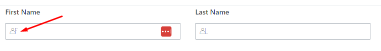
Enable form field icons(Premium) #
If you want to show icons on the input box of the form fields, enable this option.


