
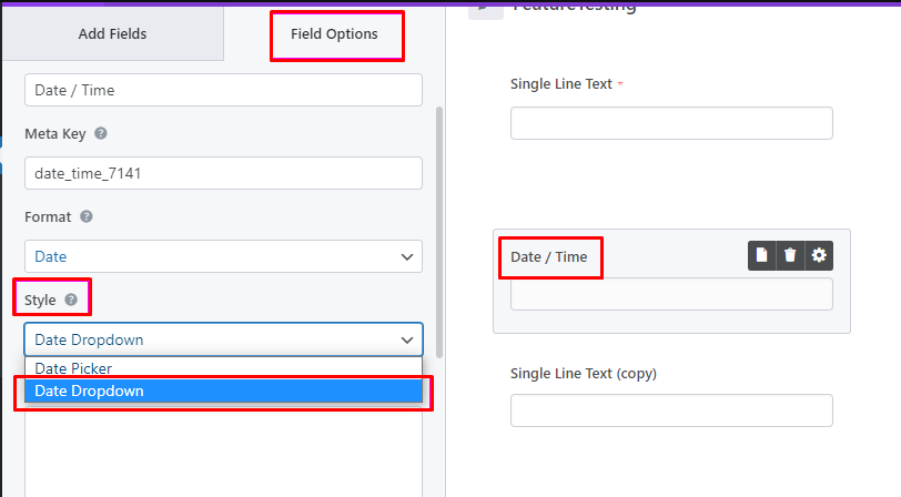
Date #
Dropdown Date Style #
You can choose a new option of ‘Dropdown Date‘ from the ‘Style‘ settings, allowing users to pick a date using the dropdown date menu.
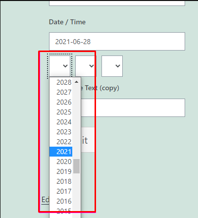
You can see this Date Dropdown in the frontend like below:
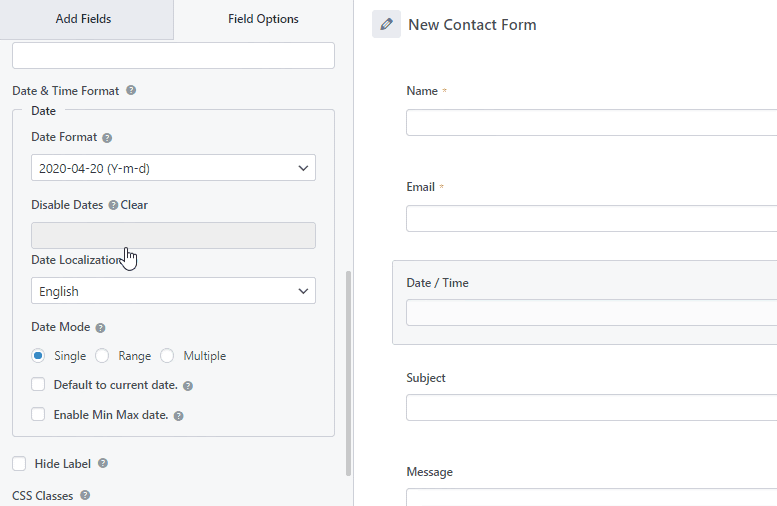
Advanced Options #
Also, there are the Advanced Options where you can change more options for the Date field.
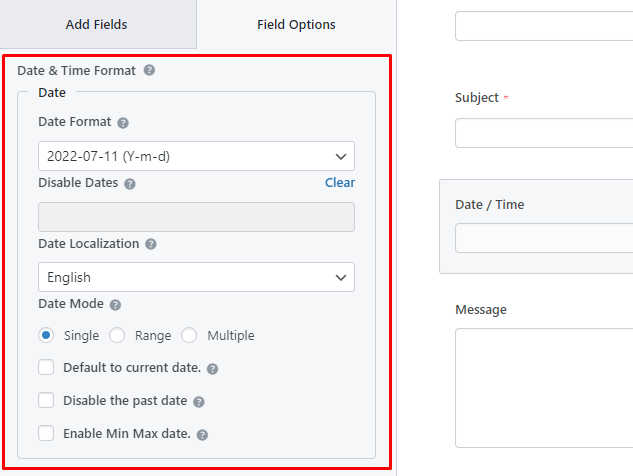
- Date Format: There are Four date formats that you can choose from.
- Disable Dates:
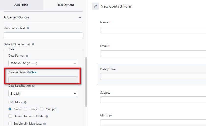
Now, you can choose the dates when you want to disable in the form. The users will not be able to select the disabled dates on the frontend.
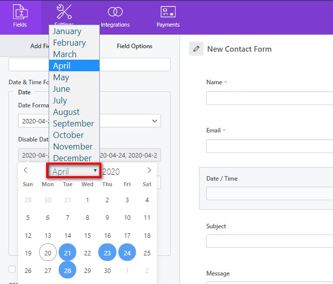
To disable dates, click on the field and a calendar will appear where you can see the month, year and dates for the month. Here, simply select the dates that you want to disable.
You can also select the month and year and disable the dates you want to disable.
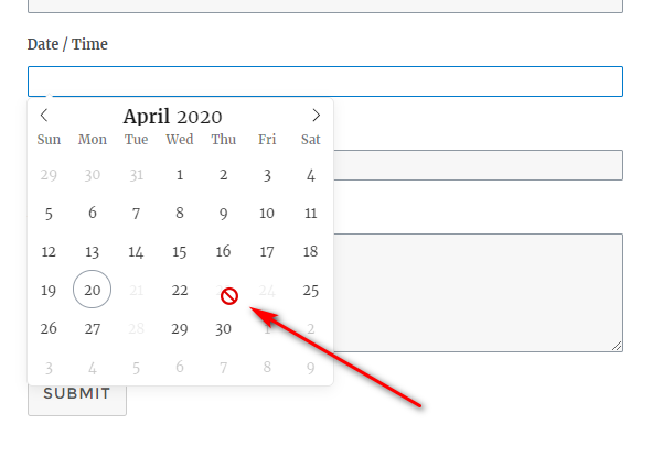
So, you can see that the disabled dates are not displayed in the frontend of the form and cannot be selected by the users.
- Date Localization: This option allows you to choose the desired date localization to display.
- Date Mode: There are three choices here. They are Single, Range, and Multiple.
- Default to current date: Check this option to set the current date as default.
- Disable the past date: Check this option if you would like to disable the past date i.e. date before the current date.
- Enable Min Max date: Check this option to set the Minimum and Maximum Date.
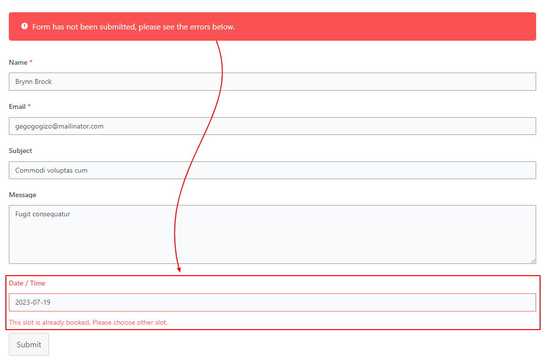
Slot Booking #
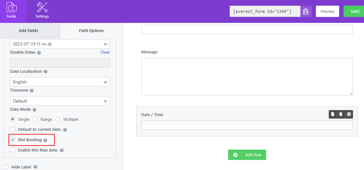
In the Advanced Options, there is another setting called ‘Slot Booking’. Using this feature, you can enable a booking form where the users can select one date(past dates are disabled) for their booking. Once the date is selected and the form is submitted, another user won’t be able to choose the same date.
Custom Input Range #
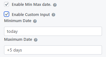
You can enable a certain range of dates and let users select only from the selected date range. For this, first, enable the Min Max date option. Then, enable Custom Input.
If you want to set the range of 10 days from today(current date), write ‘today‘ in the Minimum Date input box and write ‘+10 days‘ in the Maximum Date input box.
Similarly, if you want to set the range of 10 days before today(current date), write ‘-10 days‘ in the Minimum Date input box and write ‘today‘ in the Maximum Date input box.
Timezone #
You can select the timezone you are in from the Advanced Options.
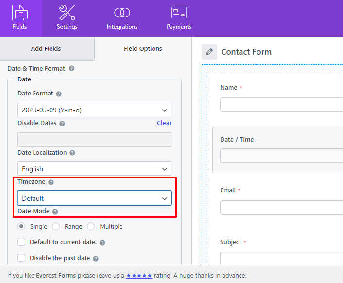
At first, the timezone will be in default. You can select your time zone from the available lists.
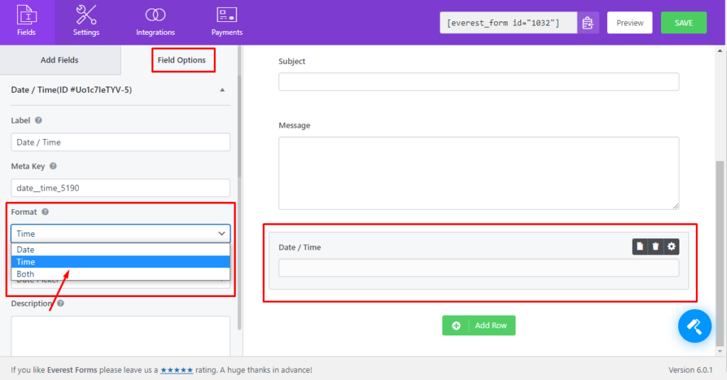
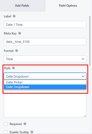
Time #
For the time, please select ‘Time’ on the ‘Format’ option from the Field Options.
Similarly, you can also choose the style in which the Time field will be shown on the frontend from the Style option.
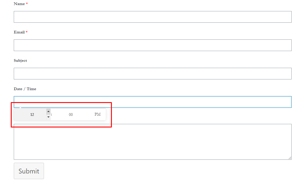
- Date Picker:
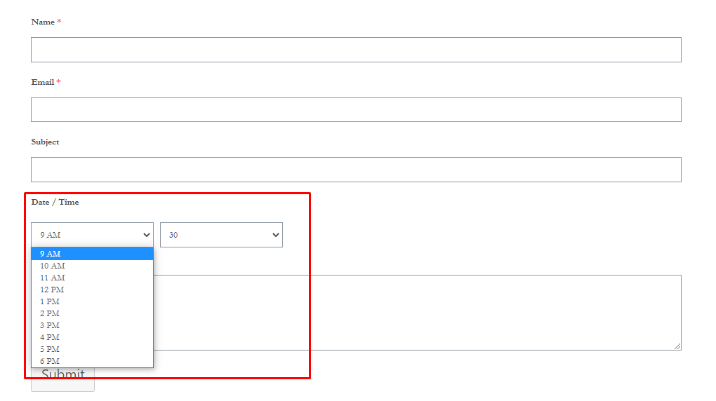
- Date Dropdown:
Advanced Options #
Also, there are the Advanced Options where you can change more options for the Time field as well.
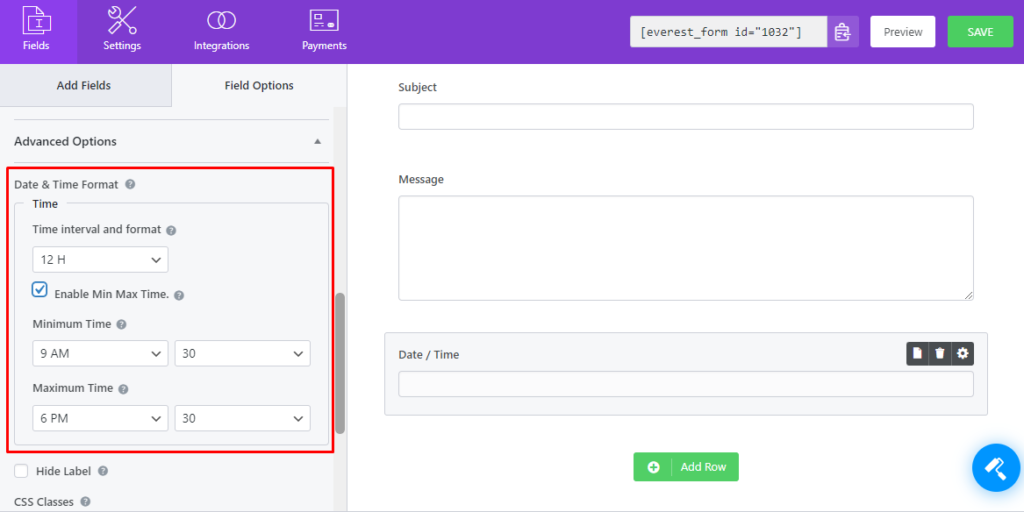
- Time interval and format: You can choose the time format to be in 12 hours or 24 hours.
- Enable Min Max Time: There are two options to choose from. You can set the minimum time and maximum time from this option. The users can’t select other time that doesn’t lie in between the minimum and maximum time. If you choose minimum time only, the users can’t select a time before that. The same goes for the maximum time.


