
This add-on will help you to edit the form that you created using the Everest Forms plugin. You can easily customize each and every component of your form with the help of this addon. It can help you to make your form very intuitive with an excellent design. To know more about this addon, let’s go through the following documentation.
Installation #
- Firstly, you need to purchase the Everest Forms Pro plugin.
- After the successful purchase, you will get the plugin zip file under your WPEverest account page.
- Now, you can download the Everest Forms Pro plugin and Everest Forms Style Customizer addon from there.
- Through your WordPress Dashboard, visit Plugins -> Add New -> Upload and then choose the downloaded zip file and then install and activate it.
- Now you are ready to use this add-on for your site.
Setup and Configuration #
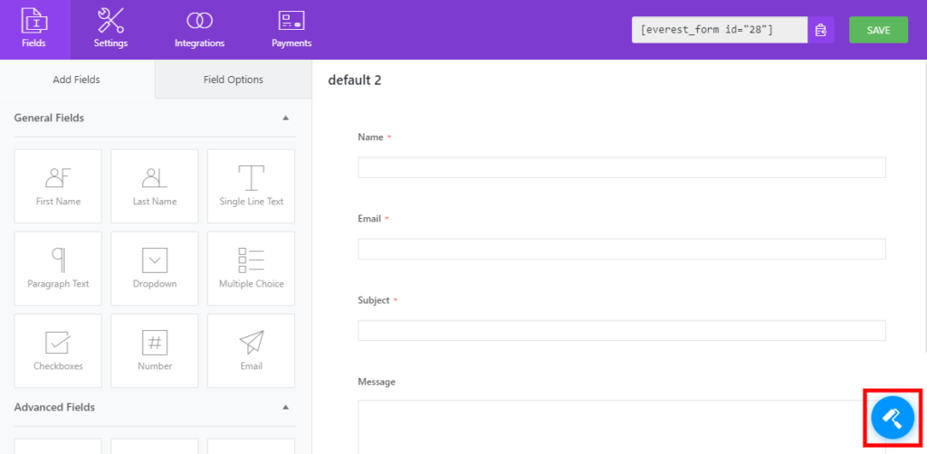
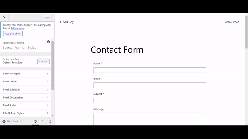
The Style Customizer is already configured on your form when you activate it. Once you finish installing and activating the addon, you can easily create your form from the dashboard. After you’ve created it, you can see the form designer icon on the bottom right of the screen of your dashboard. Click on it and you will be able to see your Everest Forms Style Customizer. You can endlessly modify your form with the help of it.
Using the Customizer #
There are basically 10 sections that you can change on your website. However, the texts and the numbers of the form cannot be edited using the addon. Only the style of the components of the form can be changed with the help of this addon. The following sections of your form can be edited as you desire:
Active Template #
This is one of the major customizable option of the addon. The Active Template allows you to change the overall layout of the form. Here, you can choose between the Default and Classic Template.
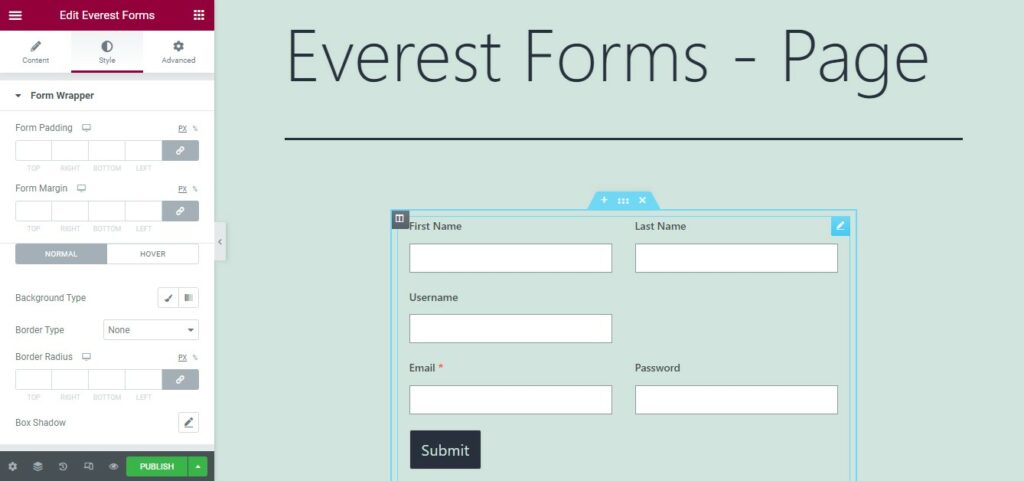
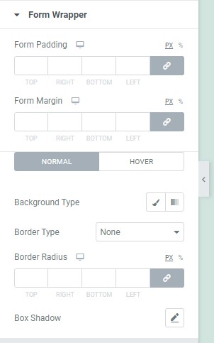
Form Wrapper #
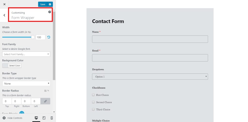
The Form Wrapper resembles the total outline and the background of the form. The options that can be configured from here are:
- Form Width
- Font Family
- Background Color
- Border Type
- Border Width
- Border Color
- Border Radius
- Form Margin
- Form Padding
Field Labels #
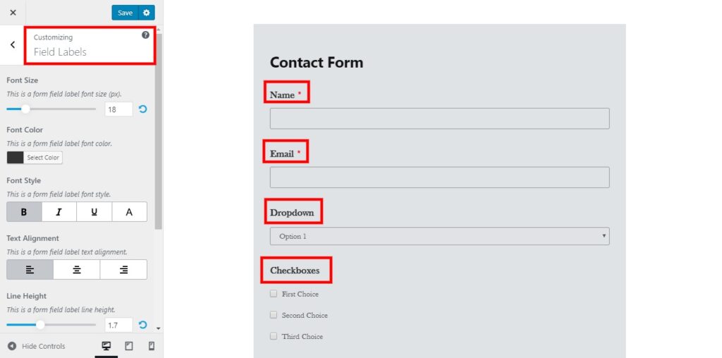
The Field Labels refer to the labels and the descriptions provided for the form fields. The following settings can be enabled or changed in this section:
- Font Size
- Font Color
- Font Style
- Text Alignment
- Line Height
- Margin
- Padding
Field Sublabels #
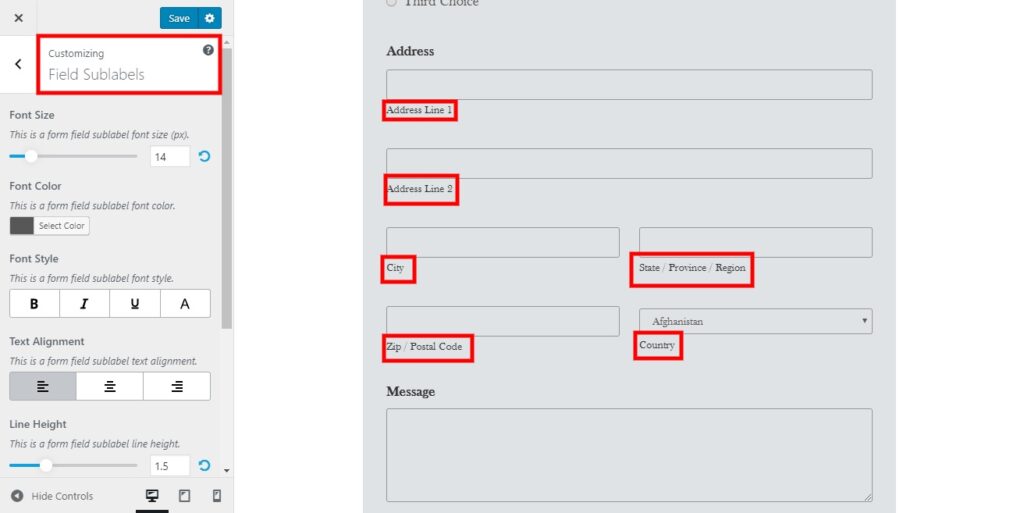
The Field Sublabels are the further subdivided labels of the fields of your forms. You can modify the following settings in this section:
- Font Size
- Font Color
- Font Style
- Text Alignment
- Line Height
- Margin
- Padding
Field Description #
The description provided to describe each of the form fields can be customized in this section. The following options are enabled for it:
- Font Size
- Font Color
- Font Style
- Text Alignment
- Line Height
- Margin
- Padding
Field Styles #
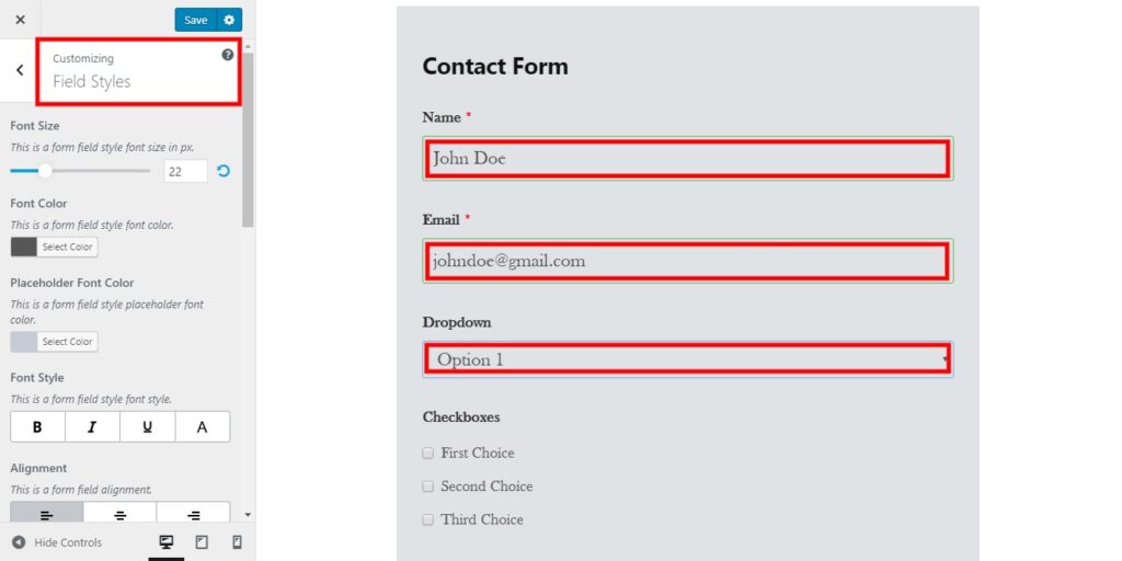
The description or the field data provided by the users to the form fields can be edited in this section. The options enabled for customization in this section are as follows:
- Font Size
- Font Color
- Placeholder Font Color
- Font Style
- Alignment
- Border Type
- Border Width
- Border Color
- Border Focus Color
- Border Radius
- Background Color
- Field Margin
- Field Padding
Radio/Checkbox Style #
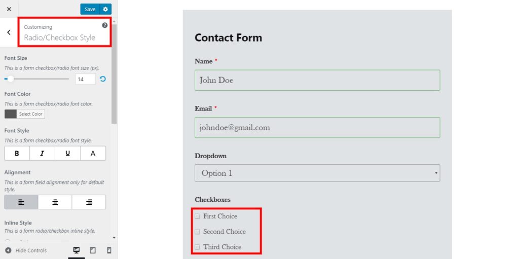
This section refers to the different type of texts, numbers, or symbols used for the checkboxes or the radio buttons. The following options are available in this section:
- Font Size
- Font Color
- Font Style
- Alignment
- Inline Style
- Style Variation
- Radio/Checkbox Color
- Form Margin
- Form Padding
Section Title #
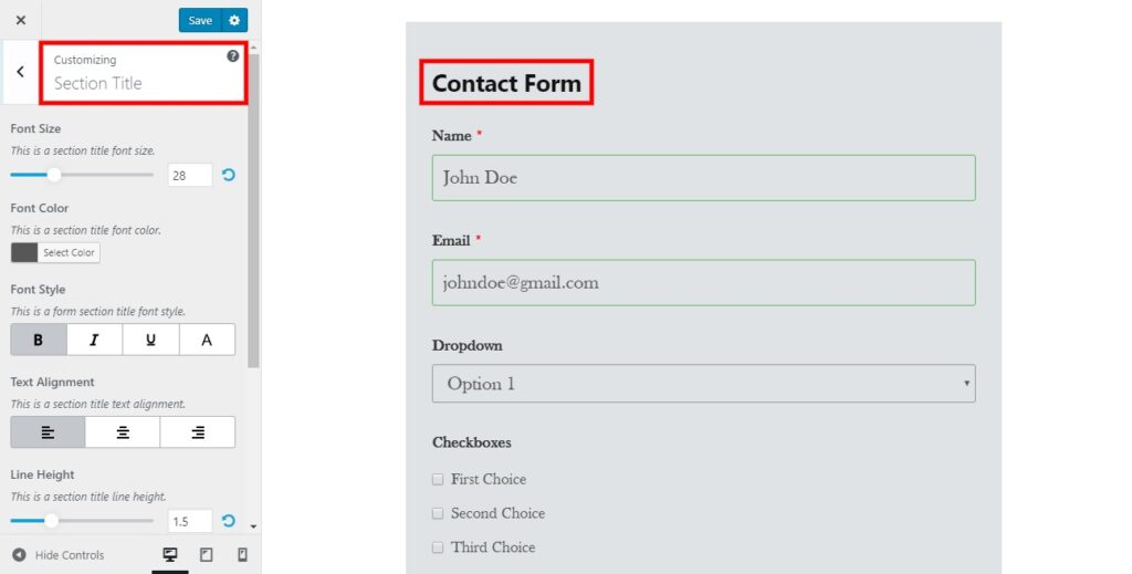
This section introduces the customizations for the section titles. The options enabled in this section are as follows:
- Font Size
- Font Color
- Font Style
- Text Alignment
- Line Height
- Form Margin
- Form Padding
Button Styles #
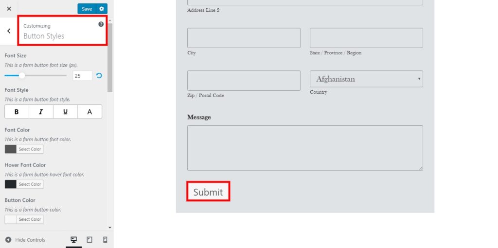
The Button Styles are the various styles for the different buttons used on your form. The options for it are:
- Font Size
- Font Style
- Font Color
- Hover Font Color
- Button Color
- Button Hover Color
- Button Alignment
- Border Type
- Border Width
- Border Color
- Border Hover Color
- Border Radius
- Line Height
- Button Margin
- Button Padding
Form Messages #
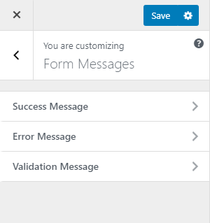
You will have three different types of messages that you can customize. All three of them have similar customization options. For example, If you want to customize the Success Message then you have the following options.
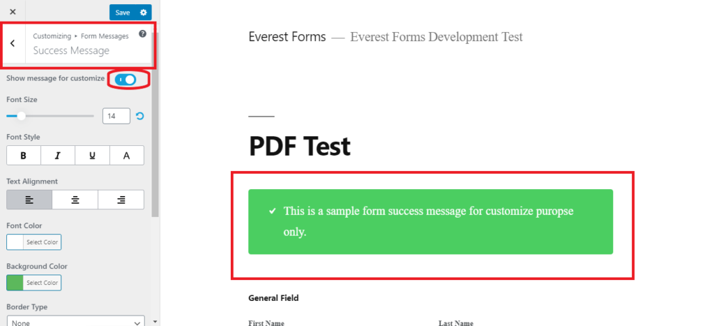
The Customization Options that you get to customize the messages are:
- Font Size
- Font Style
- Text Alignment
- Font Color
- Background Color
- Border Type
- Border Width
- Border Color
- Border Radius
You will find similar options to customize the Error Message and the Validation Message.
Additional CSS #
As the name suggests itself, Additional CSS can be used to add your own CSS codes to customize your form the way you want. You can see a CSS editor in the customizer where you can add all the CSS codes you want.
Using Elementor #
If you use an Elementor for building the pages, you can customize the form via the Elementor styling section(on the right-hand side). Most of the options available on the Everest Forms customizer page are available on the Elementor too.
Available Options(as per the sections):
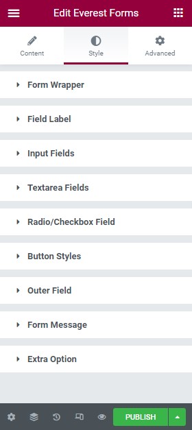
You can choose any of the available settings and expand it to style the form as per the sections.
Create Multiple Custom Templates #
In the customizer screen, go to the Template section. To save the designs you have created in a separate template, give the template name and click on Create.


